Web Accessibility for Production Teams: A Practical Playbook
Accessibility isn't a checklist you run at the end of a project. It's a set of habits, components, and tests integrated into how you ship. Here's the playbook teams actually use to ship accessible sites without slowing down.
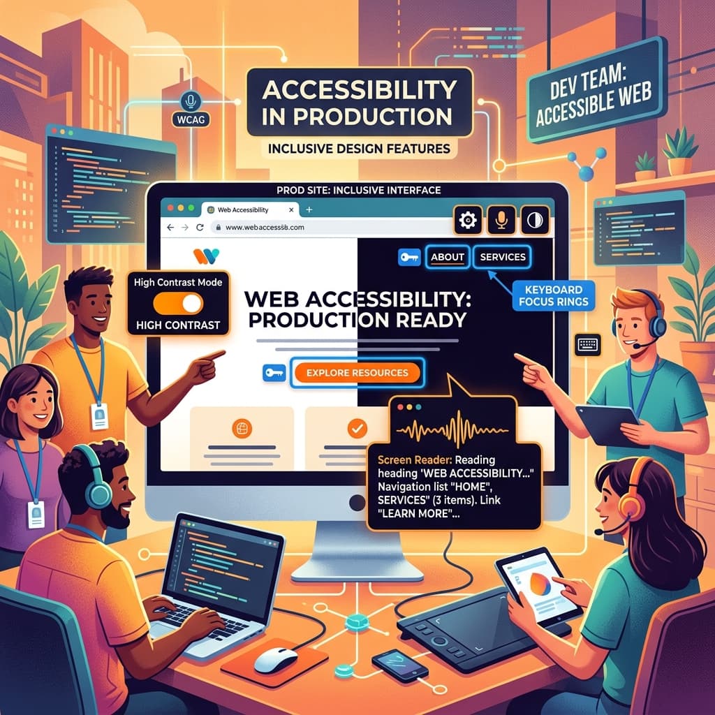
Most web teams treat accessibility as a compliance task. A WCAG audit runs at the end of a project, a list of fixes comes back, the team patches them, and everyone moves on until the next audit. This pattern produces sites that pass automated checks and still fail real users. The teams that ship genuinely accessible products take a different approach. Accessibility is built into the component library, into the design review, into the CI pipeline, and into the developer's daily habits. The result is sites that work for everyone without a separate "accessibility phase" at the end of every project. This playbook walks through the patterns that work in practice, the tools that catch real bugs, and the cultural moves that make this sustainable.
What Accessibility Actually Covers
Accessibility means a site works for people who interact with it differently than the assumed default. The categories that matter in practice:
- Visual: low vision, color blindness, total blindness (screen reader users)
- Motor: difficulty with precise mouse control, keyboard-only users, switch users
- Cognitive: difficulty processing complex layouts, distractions, fast animations
- Hearing: deaf or hard of hearing (relevant for video and audio content)
- Situational: bright sunlight, one hand, noisy environment, slow connection
WCAG 2.2 is the standard most teams target. AA conformance is the practical bar for most production sites, AAA is reserved for content where accessibility is the product itself (government services, educational platforms). The European Accessibility Act, which came into full force in 2025, made AA conformance legally required for many digital products serving EU users, including ecommerce sites above certain revenue thresholds.
The Three Components Every Team Should Get Right
If a team gets these three patterns right, they avoid the majority of accessibility bugs across their site.
Buttons and links. A button does something, a link goes somewhere. Use <button> for actions and <a> for navigation. Do not use <div onClick> because it does not receive keyboard focus, does not announce as interactive to screen readers, and does not respond to Enter or Space.
// Wrong
<div onClick={openModal} className="btn">Open</div>

// Right
<button onClick={openModal} className="btn">Open</button>
When you must style a button to look like a link or vice versa, style the correct element. Do not change the semantics to match the look.
Forms and labels. Every input needs a label that screen readers can find. Either use a <label> with htmlFor matching the input's id, or wrap the input in a label, or use aria-label if no visible label exists.
// Visible label, screen reader finds it via htmlFor
<label htmlFor="email">Email</label>
<input id="email" type="email" />

// Icon-only button needs aria-label
<button aria-label="Close dialog" onClick={close}>
  <XIcon aria-hidden="true" />
</button>
The placeholder attribute is not a label. It disappears as soon as the user starts typing, leaving no context for what the field is.
Focus management. Keyboard users tab through the page. The focus indicator must always be visible. Do not remove the default outline without replacing it with something equally visible:
/* Wrong, this breaks accessibility */
*:focus { outline: none; }

/* Right, custom focus that's still visible */
*:focus-visible {
  outline: 2px solid var(--color-focus);
  outline-offset: 2px;
}
The :focus-visible pseudo-class only shows the outline for keyboard focus, not mouse clicks, so the visual result is clean for mouse users and clear for keyboard users.
Building an Accessible Component Library
The leverage move is making accessibility the default at the component layer. If your Button, Input, Modal, Dropdown, and Tabs components are built correctly, every feature using them inherits the right behavior. Engineers don't have to remember the accessibility rules because the components encode them.
The patterns that need to be correct at the component level:
Modal dialogs. Trap focus inside the modal while it's open. Return focus to the triggering element when it closes. Add aria-modal="true" and aria-labelledby pointing to the title. Listen for Escape to close. The Radix UI Dialog component and the new <dialog> HTML element both handle this correctly if you use them.
Dropdowns and menus. Use role="menu" and role="menuitem". Arrow keys move between items. Enter activates. Escape closes. Focus returns to the trigger.
Tabs. Arrow keys move between tabs, Enter or Space activates. Use role="tab", role="tablist", aria-selected, and aria-controls. The non-active tabs are not in the tab order, only the active one.
Tooltips. Show on hover and focus, not just hover. Use aria-describedby to associate the tooltip with the element. Make them dismissable.
Toasts and notifications. Use aria-live="polite" for non-critical updates, aria-live="assertive" for urgent alerts. Don't auto-dismiss in under 5 seconds, screen reader users need time to hear the announcement.
For most projects, adopting Radix UI primitives or shadcn/ui (which is built on Radix) handles these patterns correctly out of the box. Building these from scratch is possible but expensive in time and bugs. Use the libraries.
Color Contrast: The Most Common Failure
Insufficient color contrast is the most frequently flagged WCAG failure. WCAG AA requires:
- 4.5:1 contrast for normal text (under 18pt regular or 14pt bold)
- 3:1 contrast for large text (18pt regular or 14pt bold and above)
- 3:1 contrast for UI components (input borders, focus indicators, icons that convey meaning)
The mistakes happen most often with:
- Light gray text on white (often used for "secondary" content, frequently below 4.5:1)
- White text on light brand colors (cyan, yellow, light orange backgrounds)
- Placeholder text in inputs (the default browser placeholder is usually below contrast)
- Disabled button states (the gray-on-gray often fails)
- Hover states that reduce contrast
Tools like the WebAIM Contrast Checker, the axe DevTools browser extension, and built-in Chrome DevTools contrast checker make this fast to verify. For design systems, encode contrast-tested color pairs as semantic tokens so designers and developers can't accidentally combine colors that fail.
Don't Rely on Color Alone
If a piece of UI conveys meaning, the meaning must not depend on color alone. The classic example is a form error indicated only by a red border. Color-blind users may not see the red, and screen reader users get no indication at all.
The pattern is to combine color with another signal:
<div>
  <label htmlFor="email">Email</label>
  <input
    id="email"
    type="email"
    aria-invalid={!!error}
    aria-describedby={error ? "email-error" : undefined}
    className={error ? "border-red-500" : "border-gray-300"}
  />
  {error && (
    <p id="email-error" className="text-red-500">
      <AlertIcon aria-hidden="true" /> {error}
    </p>
  )}
</div>
The error has color, an icon, an error message, and the input is marked aria-invalid. Multiple redundant signals for the same information.
Testing: Automated, Manual, and With Real Users
A complete accessibility testing approach has three layers.
Automated testing. Run axe-core in your CI pipeline. It catches around 30% of WCAG issues, but those 30% are the highest-volume, most-common bugs. For React, @axe-core/react runs in development and surfaces issues in the console. For end-to-end tests, axe-playwright or axe-cypress integrate into Playwright and Cypress respectively.
import { test, expect } from "@playwright/test";
import AxeBuilder from "@axe-core/playwright";

test("homepage has no accessibility violations", async ({ page }) => {
  await page.goto("/");
  const results = await new AxeBuilder({ page }).analyze();
  expect(results.violations).toEqual([]);
});
Manual keyboard testing. Tab through every interactive page on the site. Confirm the focus indicator is always visible, the order is logical, all interactive elements are reachable, and you can complete every task without a mouse. This catches issues automated tools cannot, like focus traps in modals or unreachable buttons.
Screen reader testing. Use NVDA (free, Windows), VoiceOver (built into macOS and iOS), or TalkBack (Android). Run the screen reader on a few key flows. The first time will be slow and confusing. The second and third time will surface real bugs in your app. This is the highest-value testing once you've fixed the automated and keyboard issues.
Real user testing. If your product serves users with disabilities at meaningful scale, periodic testing with users who actually rely on assistive technology is invaluable. Services like Fable connect teams with assistive tech users for testing. The bugs they find are different from anything internal testing catches.
The CI Pattern That Catches Regressions
Adding axe-core to your end-to-end test suite means accessibility regressions show up as failed builds. This shifts the cost of catching issues from "audit two months from now" to "this PR doesn't merge until it's fixed."
Critically, run the tests against a few representative pages, not every page. Running on every page is slow and creates noisy failures. Pick the home page, a product or content page, a form page, and a logged-in dashboard page. Together these cover the patterns that repeat across the site.
Frequently Asked Questions
Do I need to support every assistive technology?
Test with the major ones. NVDA and JAWS on Windows are the dominant screen readers. VoiceOver on macOS and iOS covers the Apple ecosystem. TalkBack covers Android. If your site works in these, it almost always works in less common tools.
Does dark mode help with accessibility?
It helps users sensitive to bright screens. It does not replace good contrast. Both dark mode and light mode need to meet WCAG contrast requirements independently. Building both correctly is more work than building one, but the audience for dark mode is large enough to be worth it on most products.
How do I handle complex interactive components like data grids?
Use a library that handles accessibility correctly. Building an accessible data grid from scratch is a months-long project. AG Grid, TanStack Table with a custom accessible UI layer, and React Aria's grid primitives are the established options. For most use cases, a simpler component (a table with sortable columns rather than a full grid) is more accessible and more maintainable.
What about motion and animations?
Respect the user's prefers-reduced-motion setting. Wrap animations in @media (prefers-reduced-motion: no-preference) or use a hook in JavaScript-driven animations. Users who set this setting have done so for a reason, including vestibular disorders that animations can trigger.
How long does accessibility remediation typically take?
For a site that's never been built with accessibility in mind, expect 4 to 12 weeks of focused work to reach WCAG 2.2 AA conformance, depending on size. Most of the time goes into form patterns, modal and dropdown behaviors, focus management, and color contrast adjustments. Building accessibility in from the start adds maybe 10 to 20% to component development time, much cheaper than remediation.
If your team is starting an accessibility effort or shipping a product that needs to meet WCAG, our team handles accessibility audits and implementation for production sites.
Tags